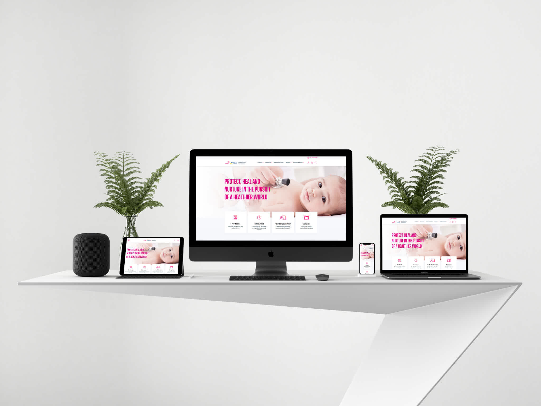
Project overview
The project’s main goal was to provide pharmacies’ staff with up-to-date and user-friendly learning resources regarding various health problems and products that can be helpful in handling those issues.
Learning resources are available as thematic hubs. Each hub consists of a few modules, some downloadable resources and external resource links. At the end of each module there is a quick quiz that users have to solve in order to progress and receive certificates of achievements. Besides the thematic hubs, there are other types of modules that feature our client’s products and explain how they can improve patients’ lives.


To make progress tracking easy two main functionalities were created:
My Learning page, where the user can track their progress in each module and download summaries and certificates
Teams functionality for tracking learning progress of a pharmacy’s employees. The portal users can register for live events and webinars hosted by the client, which can also be viewed later on as VOD.
Challenges
Making sure an educational site is rich in functionalities - such as diversified learning resources, access control and user tracking - yet works fast and is scalable. • Keeping the database simple, while not restricting the diversity of learning materials – there are different types of slides and resources which have to be updated from time to time, so the database structure had to be created with easy access in mind, but also with multiple ways of displaying the information.
Tracking the user’s learning progress and locking access to some of the resources, as their availability is defined by the user’s profession
Tracking the user’s attendance on live events and unlocking certificates only for those who actually attended them
Keeping the page’s performance high while storing large quantities of images and documents
Solution
Creating an ecosystem that adjusts to users, tracks their progress and checks their attendance. At the same time the database is only as big as it is necessary.
We used only a few necessary objects and created different record types for them. Thanks to this, all of the slides are handled the same way, which reduced the development time, but didn’t limit the diversity of the learning materials. There are different slide templates available. In case any content adjustment is needed, they can be easily edited via Salesforce UI.
We created two different types of users. They all use the same portal, but some of the pages differ, depending on the profession stated during the registration process. The users’ progress is tracked with the use of custom objects. Thanks to this, it’s easy to display the progress data to the users and generate reports about the users’ activity for our client.
On the live events site the client’s employees can use a QR scanner which we have built into our application to easily check the attendance. Upon scanning a code which was earlier sent to all attendees by email, the corresponding user is marked as “attended” in the database. Based on that information, the app can verify whether the user should receive certificate and materials
All of the images are optimized – only as big as necessary and stored together with any other resources in an external storage service, which prevents an overload of our Salesforce org.
Outcome
Scalable and useful educational site that meets all the users' needs. High capacity and reliability.
A portal that can be easily expanded by adding new learning modules
Learning progress tracking option
Easy learning progress report generation
Event/webinar registration system with an option to view webinars/VOD without leaving the portal


